Blending Smoothness
Assessing the Seamlessness of Color Transitions in Art
Documentation, Artwork, Insights, Artalytics, Metrics, Skill, Artistry
In the world of digital art, smooth blending of colors, shades, and tones is a marker of high technical skill and artistic mastery. The Blending Smoothness metric evaluates an artist’s ability to create seamless color transitions on their canvas, offering a quantitative way to assess this critical aspect of artistry.
Definition
The Blending Smoothness metric combines multiple factors—color distribution efficiency, effort, and time usage—into one comprehensive measure for how smoothly transitions between colors are applied.
\[ \frac{\log(\text{Dom Colors})}{\log(\text{Colors})} \cdot \frac{1}{\sqrt{\text{Strokes}}} \cdot \log\left(\frac{\text{Strokes}}{\text{Duration}}\right) \]
- Dominant Colors (Dom Colors): A count of unique dominant colors, reflecting central hues that maintain prominence even during transitions.
- Total Colors (Colors): Number of all distinct colors on the canvas.
- Strokes: The total number of brushstrokes applied during creation.
- Duration: Total time (in minutes) spent creating the artwork.
Key Insight: A higher score indicates smoother, skillful blending of tones, while a lower score points to sharper transitions or faster, rougher coloring.
Intuition
To understand blending smoothness, it helps to think of everyday activities:
- Smooth Gradient: Think of a sunset where colors shift uninterrupted from warm oranges to deep purples—this reflects high blending smoothness.
- Sharp Edges: Contrast this with a striped flag where colors abut sharply without blending—this reflects lower smoothness.
Visualization
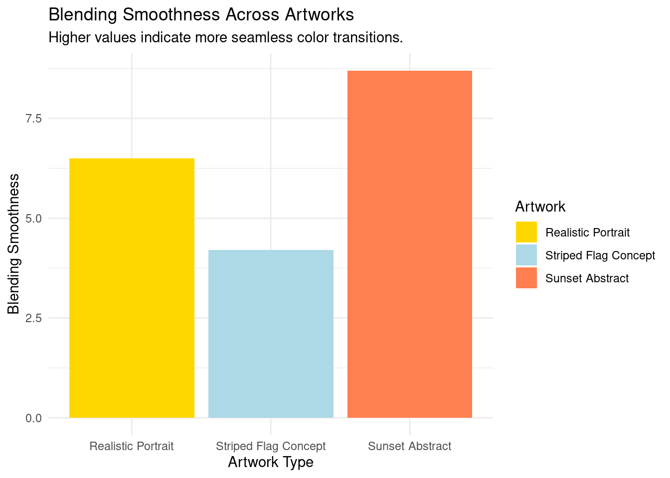
Below, we compare blending smoothness across artworks. Seamless transitions rank higher, while abrupt changes rank lower.
Applications
Artists
- Refine blending techniques with feedback from quantitative scores.
- Achieve smoother gradients and subtler translucency in color layers.
Collectors
- Assess technical excellence in masterful blending techniques.
- Differentiate between vibrant, blended pieces and works relying on abrupt color blocks.
Art Institutions
- Curate exhibitions emphasizing gradient-rich or deeply blended works.
- Compare blending techniques as expression styles evolve over time.
Case Study
Here’s how blending smoothness is applied for contrasting works (Smooth vs. Sharp Transitions):
Artwork 1: Sunset Abstract
- Blending Smoothness: 8.7 (High)
- Insights: Demonstrates fluid transitions across tones, reflecting strong mastery of blending techniques.
Artwork 2: Striped Flag Concept
- Blending Smoothness: 4.2 (Low)
- Insights: Shows sharp transitions in colors with little gradation, intentional for the style.
Roll-Up Context
Blending Smoothness integrates into the Skill & Artistry category, alongside:
- Color Range: Examines palette diversity.
- Brushing Consistency: Measures steadiness across strokes.
Together, these metrics define an artist’s creative precision and execution.
For further exploration, see:
Conclusion
Blending Smoothness helps quantify an artist’s ability to craft seamless, tonal transitions in their work. Whether curating exhibits, analyzing commercial value, or refining artistic technique, this metric provides unique and actionable insights into the skill of color manipulation.

